Hope From My Heart
One week before the 2016 Presidential Election, Songco moved from San Francisco, California to Grand Rapids, Michigan. Since then, he has observed and documented the cultural landscape of his new home. For the first time, he combines his conceptual art practice with traditional craft material revered in the West Michigan region.
As a gay American man, born and raised in New Jersey to devout Catholic Filipino immigrants, Songco assimilates his multiple identities into the predominately white and Christian culture of Grand Rapids. During a visit to a book sale at the Grand Rapids Public Library, Songco stumbled upon the book Hope From My Heart: Ten Lessons For Life, written in 2000 by Rich DeVos, the billionaire co-founder of Amway. Songco appropriates DeVos’ familiar experiences with faith and rejection and uses them as primers for the artworks’ layers of anxiety, fear, and misunderstanding.
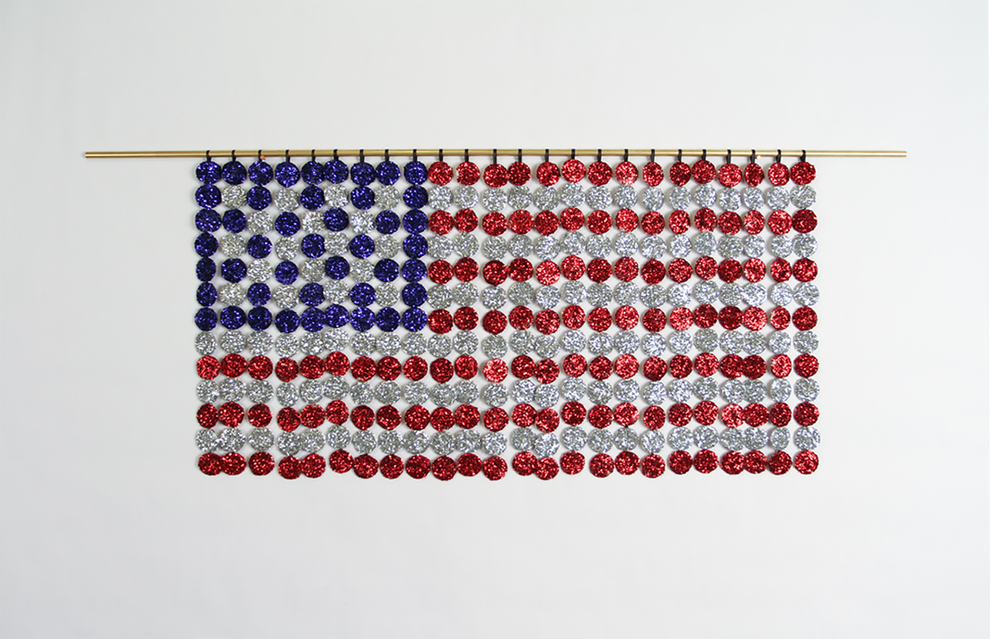
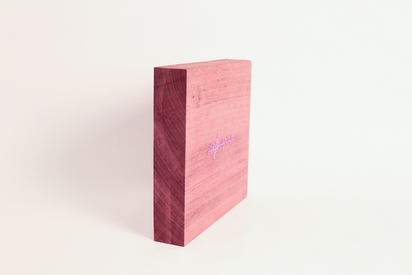
Among the artworks is Flag, a hanging sculpture of communion wafers covered in sparkling glitter arranged to form an American flag. In safe space, Songco combines the technique of stoning Swarovski crystals (a term drag queens use to describe the application of crystals to fabric) with purpleheart hardwood (a popular choice of wood used for woodworking projects as well as a purple color to represent the battleground state of Michigan). And in the anchor piece of the suite, DUNE DUDE DUPE, Songco draws rhyming words in chalk-pastel that describe the Lake Michigan shoreline dune landscape, American masculinity, and subversive humor and trickery.
While seriously examining these materials and concepts, Songco playfully narrates a story about his anxiety-ridden next chapter of life in Grand Rapids. Although he creates his artwork in a hyper-local language by using the vernacular of DIY culture and regionally accessible material, he aspires to maintain a position in the national conversation on race and sexuality in America.
This suite of new work debuted at the richard app gallery in Grand Rapids, Michigan.
DUNE DUDE DUPE, 2017. Chalk-pastel and paint on paper. 24" x 18".
I created DUNE DUDE DUPE to be the anchor piece of Hope From My Heart. It references conceptual artist Mel Bochner and his use of rhyming words to arrive at meaning. The group of words point to the popular West Michigan dune landscape, masculinity, and subversive humor and trickery. I also painted bead necklaces onto the letters as a way to give the words a kind of physical weight and substance. The necklaces are a personal motif that I began using with my 2015 work Revelry, an ArtPrize Seven installation that referenced the beaded curtains of Felix Gonzalez-Torres. I think the piece also characterizes Trump and his visit to Grand Rapids as his last city on the campaign trail before he became president.
Triangle Box, 2017. Plastic, wood. 8.75” x 17” x 3.25”
I filled a traditional triangular flag box with my personal motif of the bead necklace. When a flag is placed in the box, it represents honor and often commemorates an American war veteran who died in battle. But what does it mean when there are beads in it? For me, the beads are loaded with a variety of meanings – from celebration (popularized by Mardi Gras, a holiday of debauchery before the Christian season of Lent), to life and death (constructed by Gonzalez-Torres’ beaded curtains), and consumption (the beads are a cheap and disposable product fabricated in China).
Flag, 2017. Communion wafers covered in glitter, cotton, brass. 14.5” x 36” x .5”.
Flag brings together the Body of Christ and sparkly glitter. I’m so excited to be creating my first American Flag to add to the long lineage of artists representing this symbol. This isn’t the first time I’ve covered wafers in glitter, but it is the first time I’m arranging them into a representation of the American Flag. The political climate has energized my interest in nationalism and its relationship to Christianity.
Confessional Board (smiled), 2017. Paper, rope, wood. 15.25” x 15.5” x 1.5”.
Confessional Boards is a series of hanging sculptures where I burned letters into planks of wood and then decorated with paper flowers. Referencing Glenn Ligon’s aesthetic of type, I wanted to explore my observations in Grand Rapids and my projections onto human behavior through simple personal confessions. In (smiled), I point to an interaction that happens often between me and other random anonymous men. In Grand Rapids, the encounter is usually called “Michigan Nice,” but as an outsider, I felt like it could be a kind of homosexual flirtation (which is represented by the kitschy paper flowers). The smile and flowers also represent a kindness that may be masking some racism he has towards me as a person of color.
Confessional Board (sorry), 2017. Paper, rope, wood. 14” x 18.5” x 1.5.
Confessional Board (Pepsi), 2017. Paper, rope, wood. 15.5” x 15.75” x 1.5”.
In (sorry), I continue highlighting the “Michigan Nice” attitude with a common phrase of apology. During brief interactions with other people, folks often say “I’m sorry,” and I often don’t know why they are apologizing. Whether it be someone speaking over me in a conversation (which I think is fine and part of a natural dialogue) or someone standing in line and noticing that I had already been waiting (which is fine, too), the choice of apologizing rather than saying “Excuse me” or another variation on that phrase interests me. I also see this apology as a deeply rooted Christian behavior, a kind of penance for something completely unrelated to the current situation.
(Pepsi) is a nod to a very recent pop culture moment citing the protest-themed Pepsi commercial featuring Kendall Jenner. Never has an advertisement resonated so much with me until this commercial was released. As an artist, I’m proud of my cultural criticisms and resistance through my artwork, but I definitely drink a Pepsi while I work, so it was strange to see the advert exposing my studio practice and suddenly feeling like my identity was no longer valid because my personal behavior became a commercialized pop culture joke.
safe space, 2017. Swarovski crystal on purpleheart wood. 9.75” x 10.25” x 2”. Edition of 10.
The sculpture safe space combines the technique of stoning (a term drag queens use to describe the application of crystals to fabric) and the popular hardwood used for woodworking projects. The purple color represents the battleground state of Michigan (red + blue). While the phrase “safe space” is a common label placed on an area of tolerance and respect for LGBTQ individuals, it is also something I repeat to myself as I navigate this city looking for a place that will tolerate and respect me when I hold my boyfriend’s hand. I have read too many headlines of hate crimes carried out in stores, parking lots, and on public transportation to comfortably let go of this neurotic behavior. safe space is also a nod to the creative process – the bare surface of the wood is ready for a spark of creation.
Shots Fired #4, 2017. Swarovski crystal on paper. 18” x 14”. Edition of 23.
Shots Fired #7, 2017. Swarovski crystal on paper. 18” x 14”. Edition of 23.
On the first night at my new apartment in Grand Rapids, there was a murder-suicide on the front porch of my building. My thoughts and prayers have been with the family of the victims ever since. My anxieties about guns and violence have escalated to the point where I needed to create a work of art that acknowledged the experience while also appropriating the event into something manageable for me. In Shots Fired, I place Swarovski crystals onto target practice paper. Made in an edition of 23, the work brings a queer aesthetic together with a traumatic event that gives the viewer a sneak peak into a larger, ongoing project I’ve made titled the Society of 23.
Solo Cups, 2017. Porcelain. Variable dimensions.
In collaboration with Jeff Ham Ceramics, plastic solo cups are recreated with porcelain. In Grand Rapids, the language of craft material is the language of art. I wanted to share my interest in celebration – particularly with popular college drinking games such as Flip Cup and Beer Pong – in a language that is familiar with the art audience in this region. The scene created with the cups in various states of use references parties in seemingly masculine settings like fraternity houses and game day tailgating.
Books and DVDs, 2017. Chalk-pastel on paper. 9" x 12".
During one visit to the Grand Rapids Public Library, I purchased several books from a book sale: Hope From My Heart: Ten Lessons For Life, Holy Bible, and The Pill Book (a little nod to Jeff Koons, while referencing recreational drugs, partying, and Rich’s own life-saving medical treatments shared in his book). In Books and DVDs, I drew these titles stacked on top of a DVD box set of Queer as Folk I already owned. It's a simple drawing of subject matter that describes the kind of person who I am today in a style that plays to the Grand Rapids art audience’s preferred drawing aesthetic of realism. The hefty objects seemingly float in a black void as a visual representation of my own layered identity in this unfamiliar terrain.


